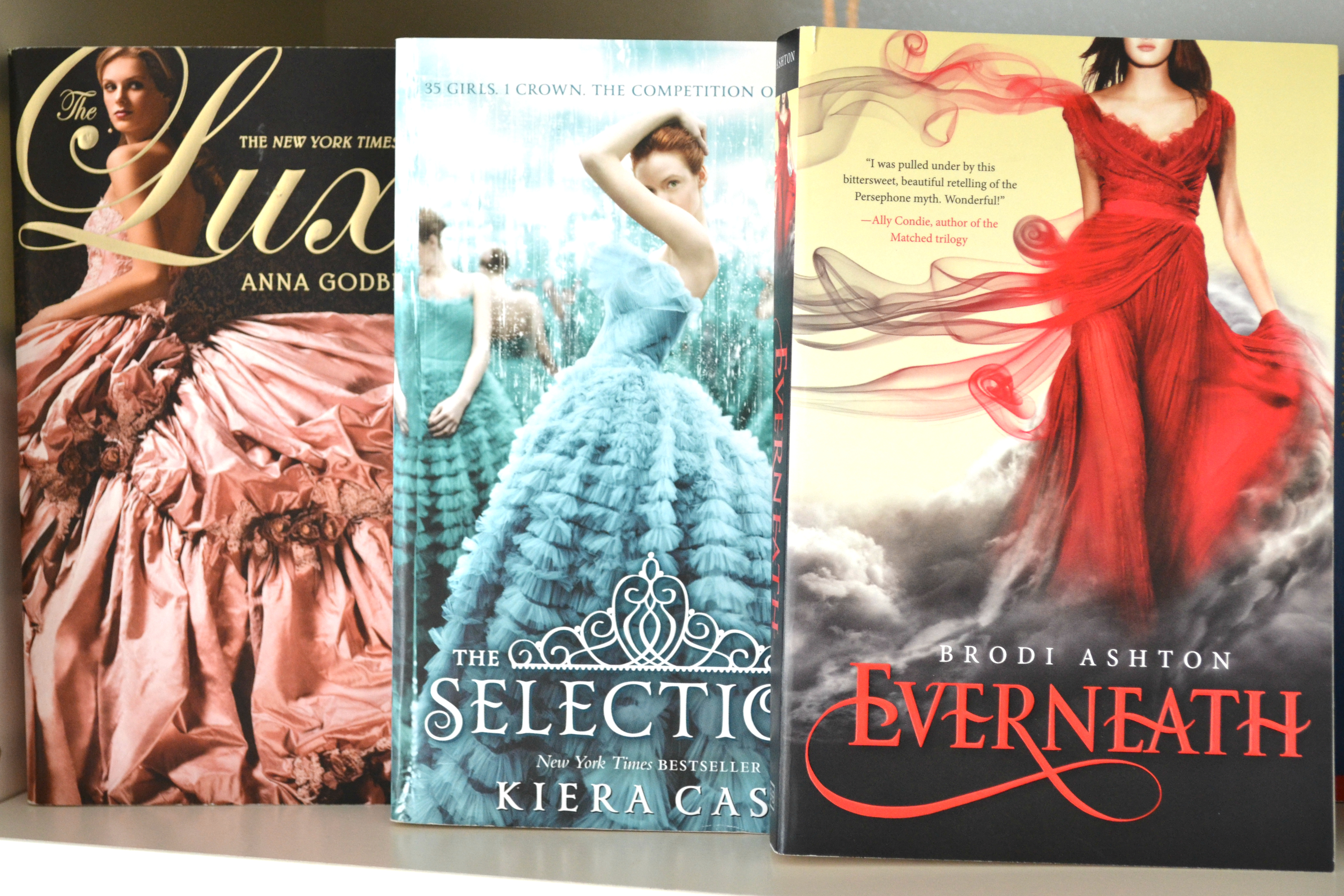
There is a fad among book covers in Young Adult (YA) publishing, and it needs to end now. I’m talking about girls in ball gowns.

I first noticed this eyesore back in 2007. Unbelievably, this ridiculous trend has lasted for well over eight years. At the time, Anna Godbersen’s The Luxe just started hitting bookstores, and its cover was eye-catching and different from the standard YA lit. geared toward girls (think photo close-ups of bare feet on the beach or hands plucking petals off flowers à la Sarah Dessen). At least for The Luxe, the cover somehow related to the plot and made sense.
Fast forward to 2015, and you can’t walk down the YA aisle at a bookstore without encountering covers chock full of girls gazing off into the distance with long, flowing hair blowing in the wind while twirling in a floor-length, ruffled ball gown (like Kiersten White’s Paranormalcy and Lauren Kate’s Fallen). Sometimes the cover doesn’t even have anything to do with the plot. See Ally Condie’s Matched or Cynthia Hand’s Unearthly—the characters don’t wear ball gowns, but the cover art has them decked out in their finest petticoats while looking around seemingly confused by their surroundings.

Haven’t noticed this trend for yourself yet? Check out Listopia on Goodreads; there are multiple lists compiling titles that have jumped on the seemingly never-ending ball gown train.
There is one good thing that comes out of this ridiculous trend, however. It showcases the lack of women of color on YA covers, and ultimately, in YA writing itself. But that’s another rant for another day (though if you would like to read more about that topic, there’s a grassroots campaign that you can learn about here).
So, YA publishers of the world, I beg of you—enough with the white girls in ball gowns flouncing around on your covers! It is tired, it is limiting, and it is time for something new.
Header image via Rosie Gutmann. Photo of Luxe via Wikipedia. Photo of Unearthly via Goodreads.


